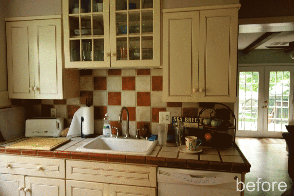
Beth loved her 1930’s Brick Colonial, but hated its tiny kitchen. It was dark, hard to clean, lacked storage and counter space making it difficult for even one cook to use. She needed a full kitchen overhaul.
Getting Started:
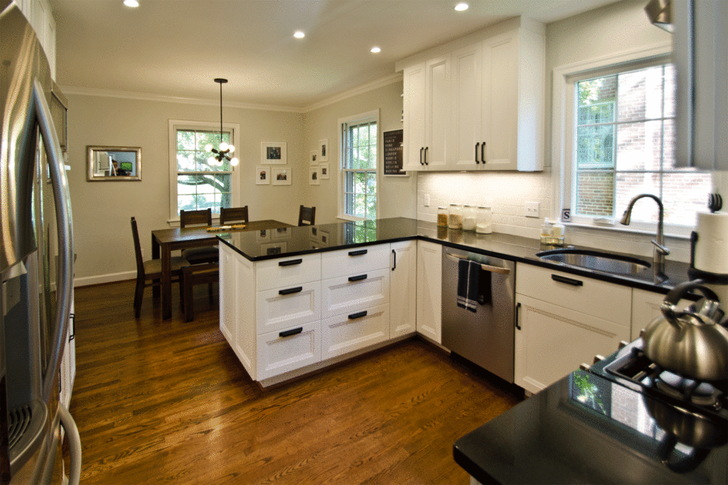
Beth knew she wanted to tear down the wall between the kitchen & dining room, but there were a few parameters. We could not move any of the windows and we needed to leave enough space for a 6 person dining table.
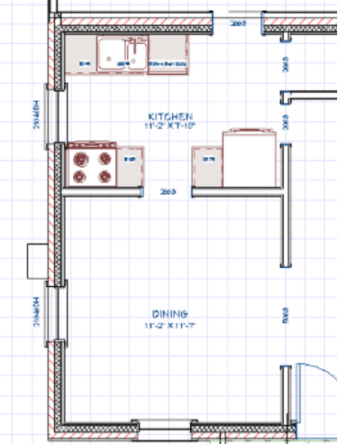
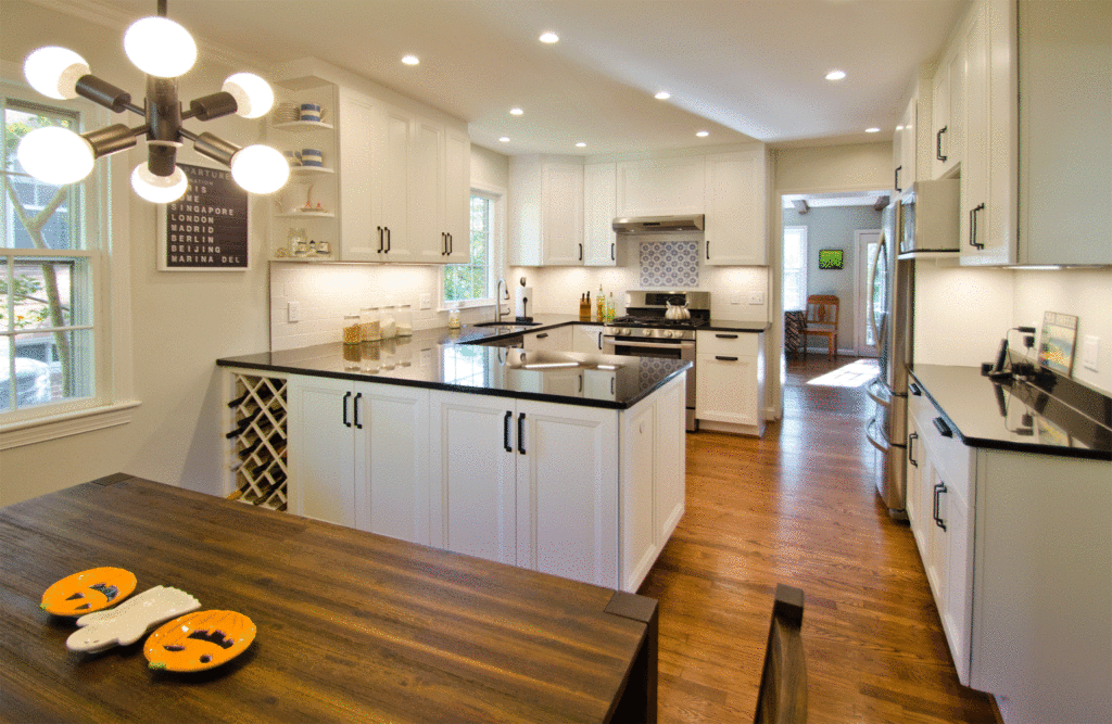
With the new design plan we were able to claim an additional 44 sq. ft. giving us about 50% more kitchen space. However at a total of 121 sq. ft we still had a small space to work with so we needed to get creative with the design.
Layout Planning:
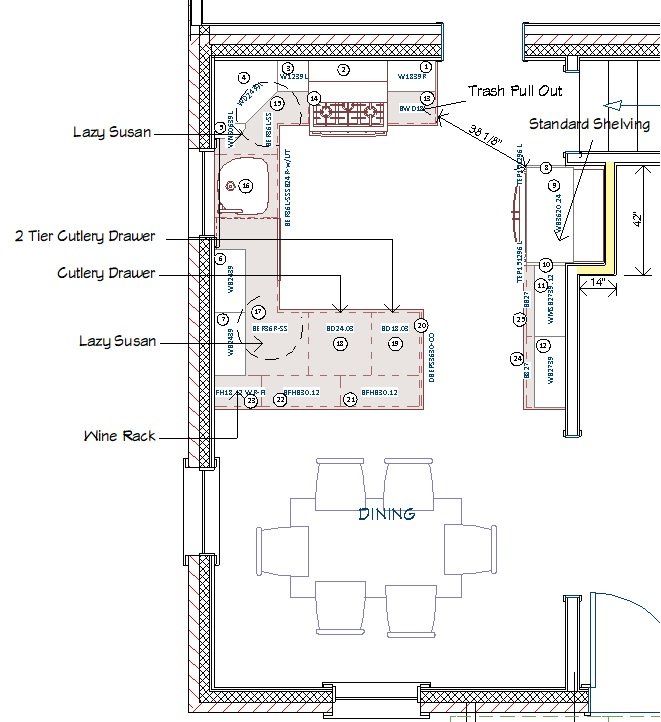
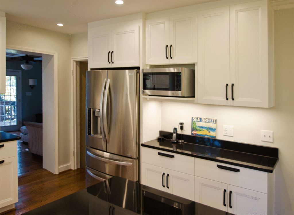
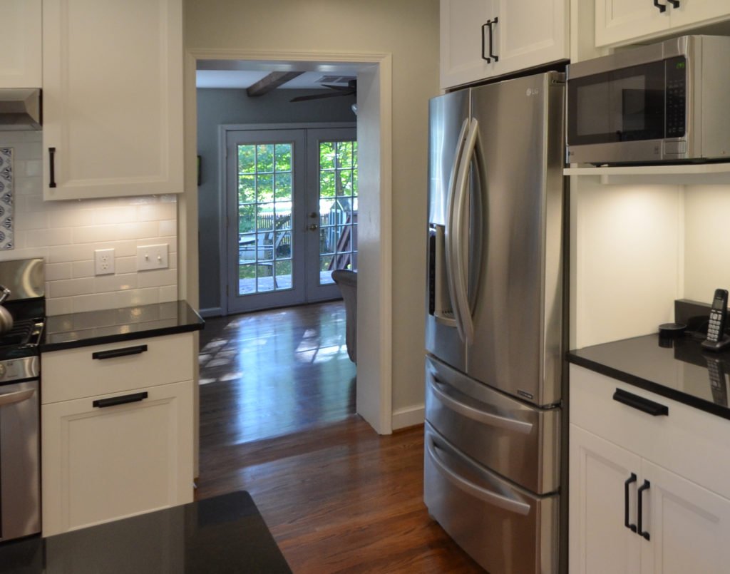
We were not moving any windows so the sink placed itself and we laid the design out around it. The stove was moved to the rear wall to allow for an overhead exhaust and clean sight lines into the dining room. That left us without a spot for the refrigerator. We decided to recesses it into an opening between the original kitchen and livingroom. Now that the kitchen was open to the dining room that pass through was redundant. We reduced the depth of the adjoining cabinets to 15″ allowing them to fit within the original width of the kitchen and avoid moving another wall. These cabinets create a family planning zone, a big bonus for the home owners. We added a few UBS ports and it’s now home to the family, calendar, mail drop zone and an amazon Alexa.
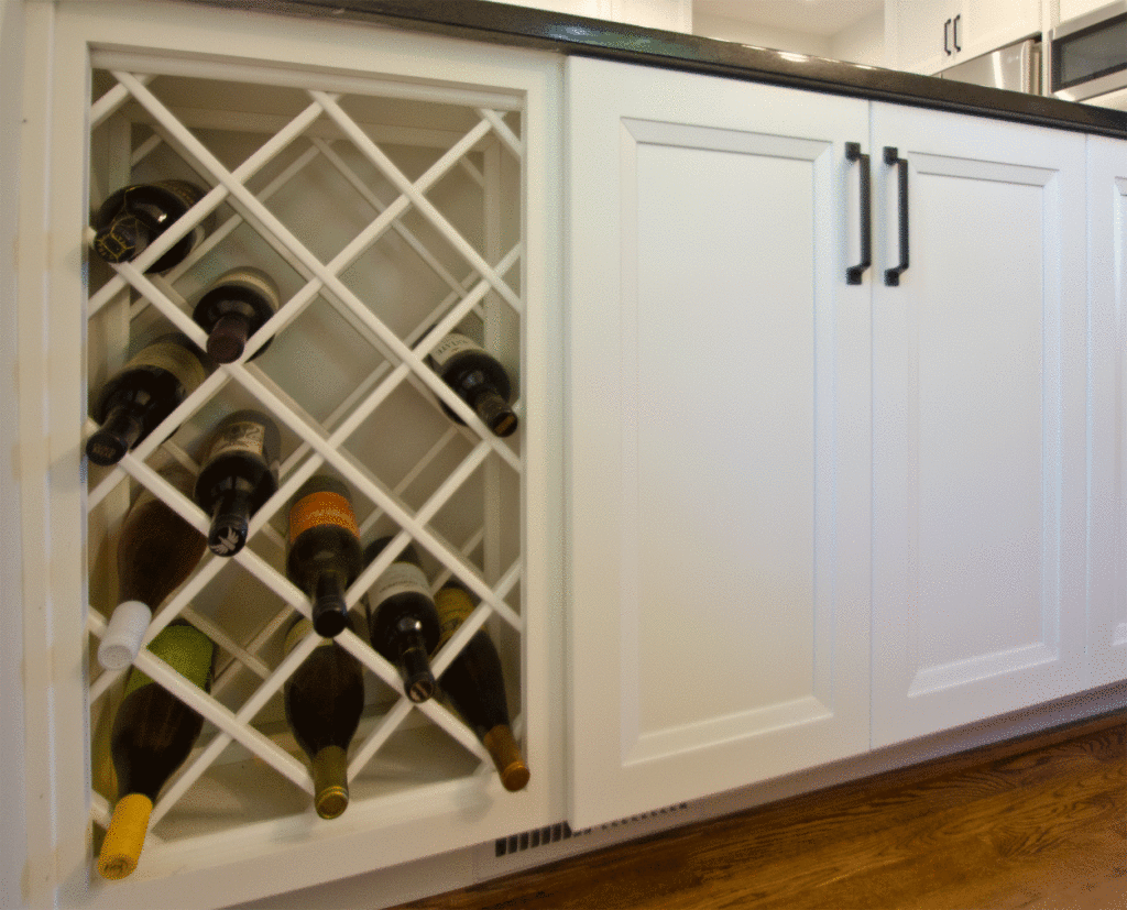
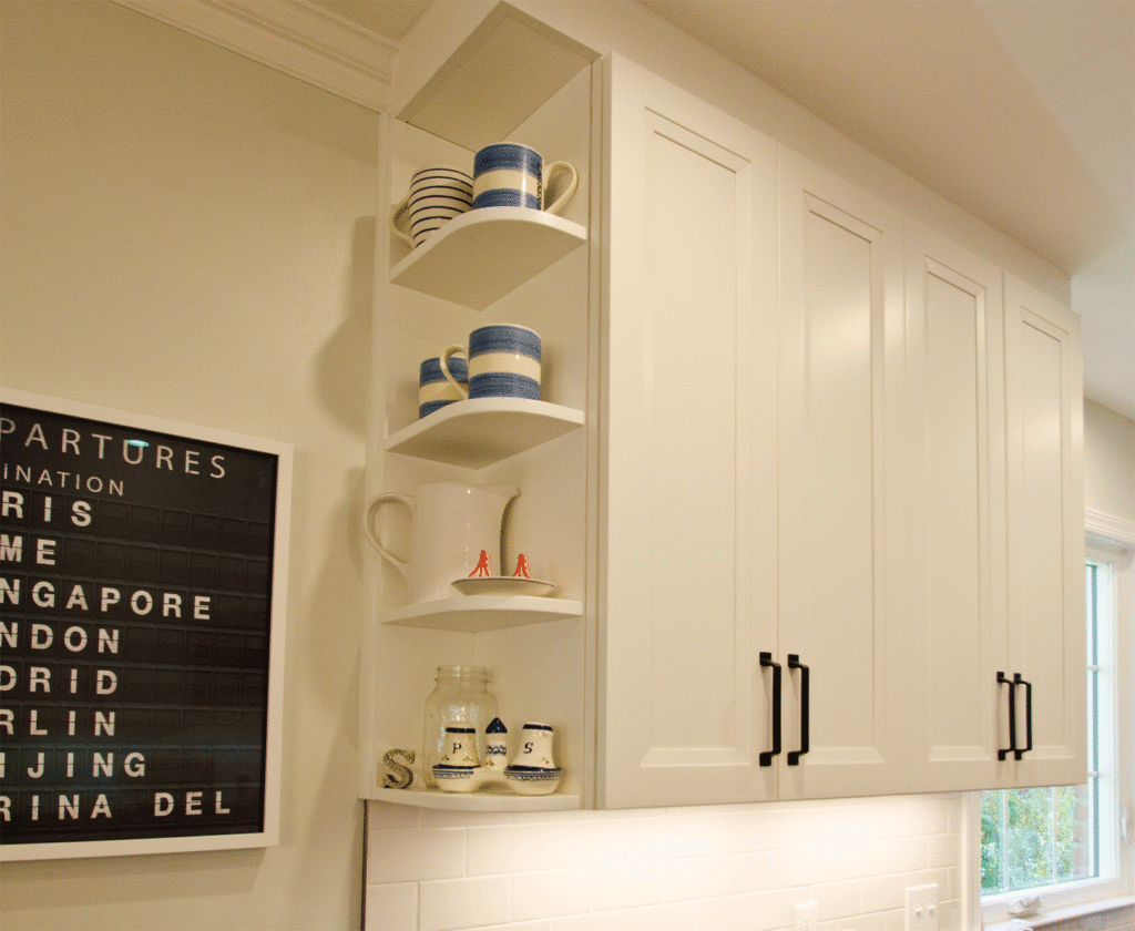
Two built-in china cabinets were sacrificed to make this new combined kitchen and dining layout work. It was important to Beth that we find a way to make up for that missing storage. Eliminating the traditional bar stool space gave at the peninsula gave us room for three more storage cabinets. These cabinets now house all their special occasion china that was once stored in the built ins. We even had room for a wine wrack, a wish list item of the home owners that they were originally unsure how to incorporate.
Increasing Functionality:
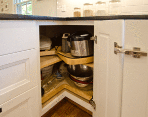
A U-shaped layout provided the most countertop so we started there. Two heavy duty lazy Susan cabinets became the corner stones of this kitchen eliminating dead space. The Homeowner designated one for pantry items and the second for cooking equipment. Drawers were used in the peninsula to maximize storage.
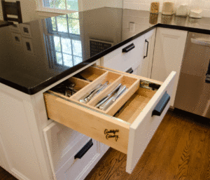
While we had more than doubled the countertop are and storage capacity of this kitchen it was still on the small side so we layered in a few extra features to really maximize the space. We selected a tilt out tray at the kitchen sink to keep clutter off the counter. The cutlery drawer has a two tier divider doing the work of two drawers. We also included a double can trash pull out to keep the trash can out of the way.
Enhancing Style:
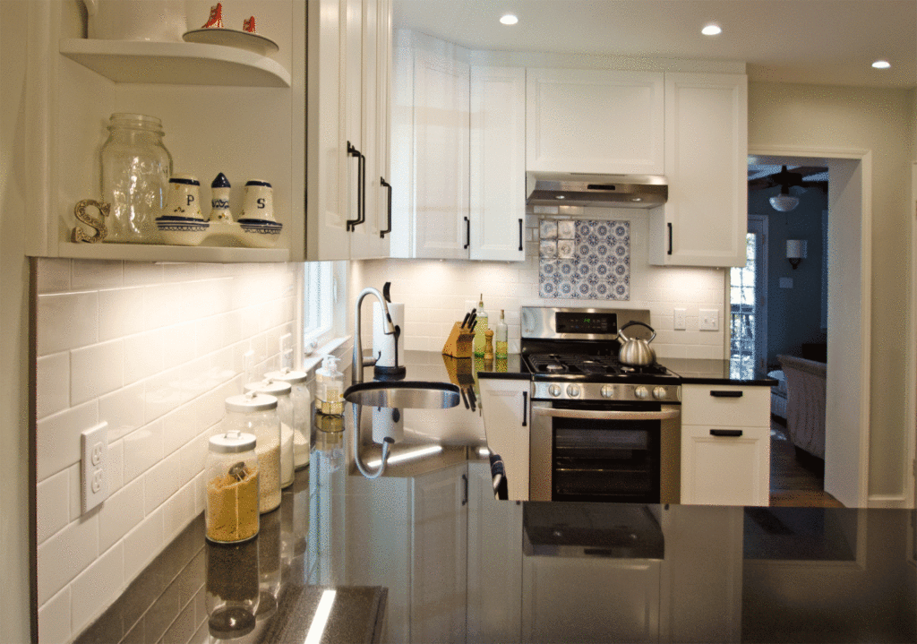
It was important to us that the space be both beautiful and functional. The black and white design is timeless. The palate set a good backdrop for the hand painted tiles Beth selected for over the range. We added some high end details to the CandleLight Cabinets to make them stand out and to elevate the space. A knick knack shelf displays personal items and makes use of the hard to reach space on the opposite side of the peninsula. The toe kick was wrapped all the way around the peninsula for a seem less look. We also had flush ends or furniture panels built into the exposed ends of every cabinet.

Coping with Existing Conditions:
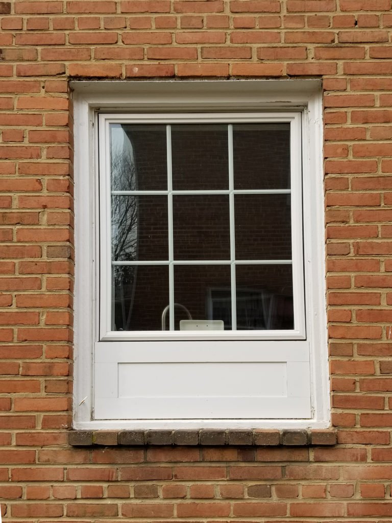
There were a few technicalities we had to deal with to make this new lay out work. First, the window over the sink had to be shorted to accommodate full height cabinets. A patch to the brick exterior would have been costly and patches hardly ever matches the original brick. Instead we installed a vertex panel, which added character, saved money and looked better than a brick patch would have.
Second, the wall we removed contained the HVAC supply for the dining room. The original exterior walls were plaster on furring strips so we could not simply move the vent over to the outside wall. Instead we put it in the toe kick of the peninsula.
Finally, the rear addition was about 1.5” higher than the original home. It was important to the homeowner not to have step. It took some finessing , but our carpenters were able to smooth out the sub-floor to create a sloped transition.
Overcoming Construction Obstacles:
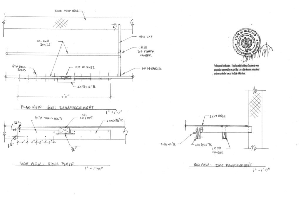
Once construction started we uncovered a few real headaches left over from previous remodels. The previous master bath renovation had made swiss cheese out of the ceiling joists. An engineer was brought in and custom steel braces were installed to support the existing bathroom.
Even with those repairs the ceiling was still woefully out of level. Crown molding that touches the ceiling in some spots but dips 1” down in others was not acceptable. We decided that leaving a gap that was wider and in some spots than others was just as bad, plus our cabinets were already on order and dropping them lower would mean shortening the backsplash. We considered leaving out the ceiling, but the change order was too costly to be practical. Ultimately we built a small bulk head flush with the cabinets to camouflage the sloped ceiling.
Living the Dream:
The final product exceeded the homeowners original wish list providing double the storage and counter space and enough working room for 2 chefs. The solid surface counters are much easier to clean than the original tile. Even with a smaller window taking down the wall and adding ample lighting have created a bright kitchen that is a pleasure to cook and dine in.
To see more from Beth’s kitchen remodel visit her project in our gallery. If you would like to schedule a tour of a homes like Bath’s or a free consultation with one of our designers you can contact us here.