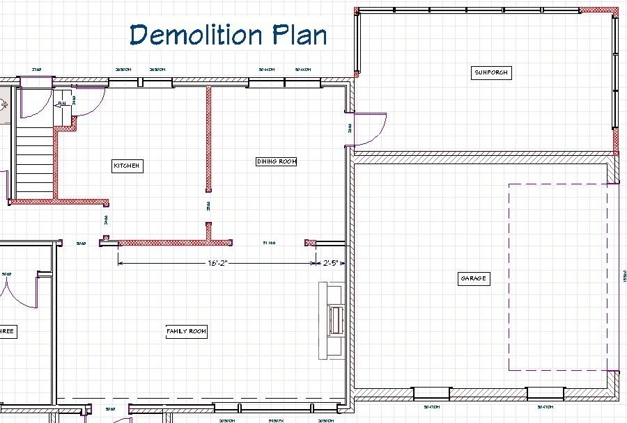
Anne came to us with one main goal: improve the flow of her home. She wanted an open concept floor plan. The house consisted of closed-off rooms that lacked functionality. She hoped improving the layout would make it easier to get out the door in the morning and enhance the quality of their family time in the evening.
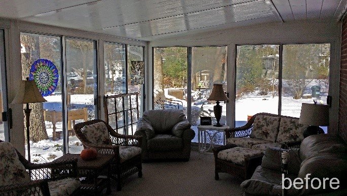
Merrick’s team took that idea and expanded upon it. Not only would we open up the kitchen, but we would shift and expand it. The family rarely used the formal dining room. So, we took that space for the new kitchen, doubling its square footage. The garage was connected to the home by an underused sunroom. We tore it down and rebuilt the space with a tight envelope so we could incorporate it into the house.
Her home had two regularly used points of entry. A mudroom in one part of the house would not necessarily relieve congestion at the other. So naturally, we designed a home with two mudroom areas, one to each side of the kitchen.
The Changes Begin
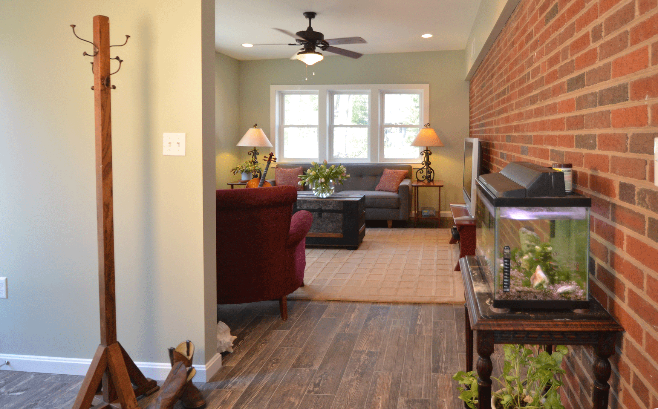
Initially, access to the basement stairs was in the middle of the kitchen. We needed to move that out of the kitchen to improve the traffic in the home. So, we pulled the right side of the kitchen away from the stairs creating a wide hallway and large coat closet (Mudroom 1). The old exterior sunroom door was removed, and the opening widened to create a smooth flow from the garage to the second mudroom and into the kitchen. This mudroom is used every day while the kids get ready for school. It has a door directly to the back yard and garage. It is wide enough to house custom cubbies the homeowner is planning to build for themselves. There was enough space in the original porch foundation for a small bonus room, which the client uses as a quiet study and music room.
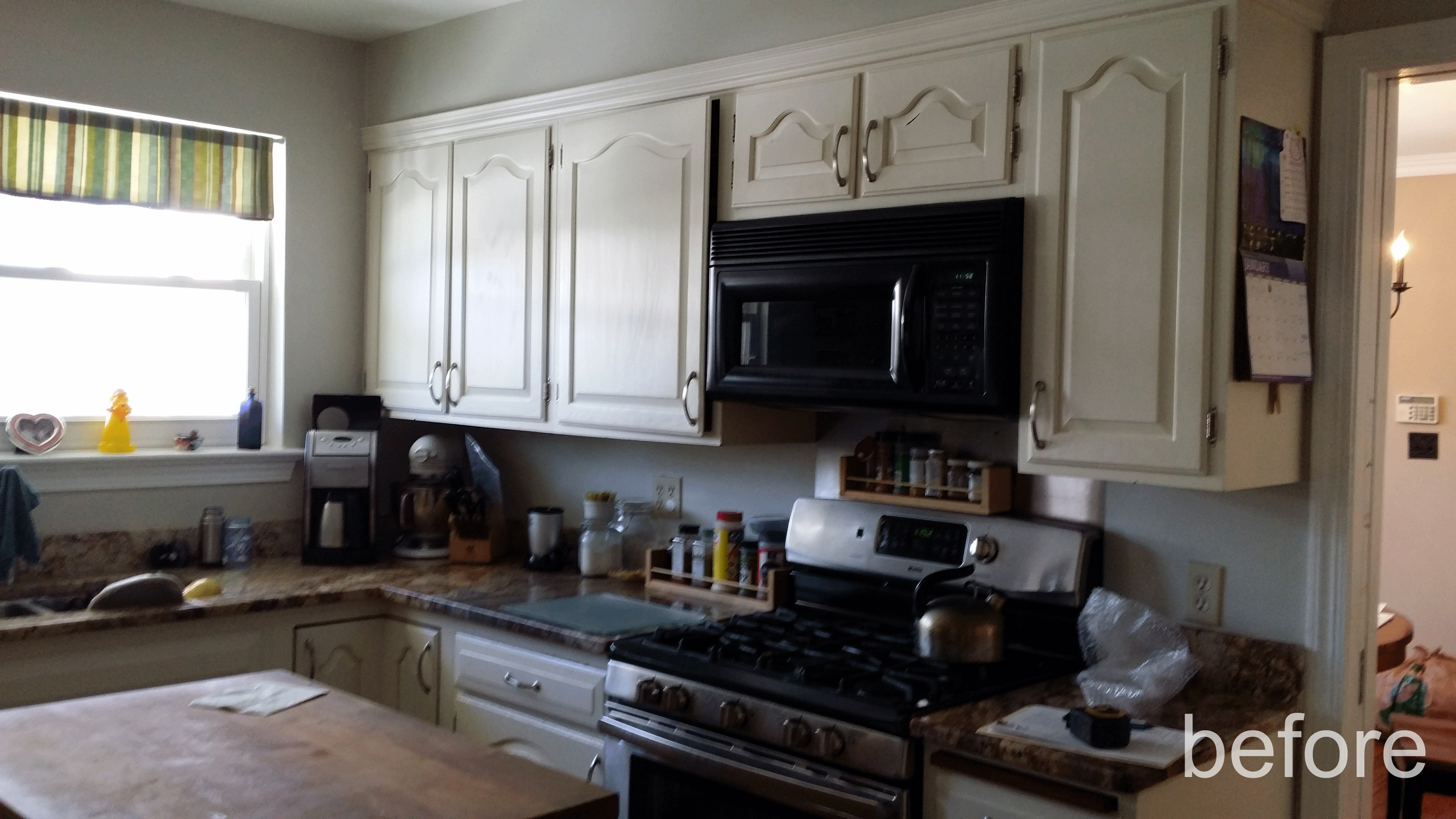
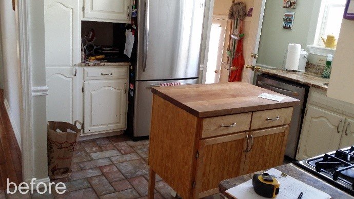
Creating a kitchen with better flow was the key to this design. The original was tight and lacked counter space. To compensate, the homeowner was using a credenza as an island, which made things even closer. The oven door could not open completely without pushing it out of the way. If the dishwasher was open, the fridge was blocked. If two people tried to cook in there, it would be chaos. Eating in the original kitchen was never an option.
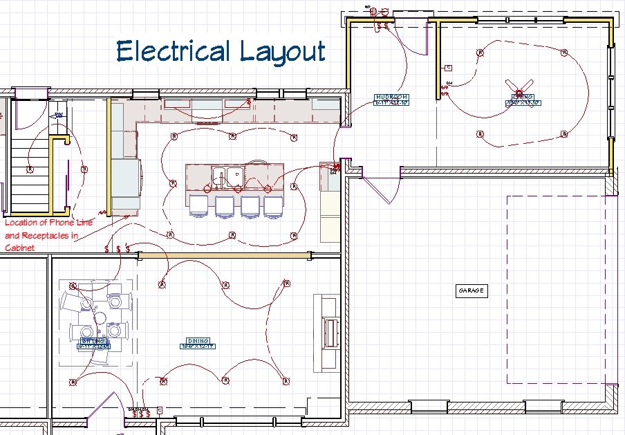
Beautiful trees surround this home, but their shade makes the home gloomy. We added recessed lighting on dimmers throughout the great room to brighten things up. A few outlets were also put onto switches to control lamps for softer lighting when desired. LED undercabinet lights cast light onto work surfaces helps with prep work. Additionally, pendant lights soften all the task lighting and allow for ambient lighting during parties and meal times.
Unexpected Challenges
Once construction got started, we uncovered a few problems. To keep the budget in check, we wanted to reuse the foundation of the original porch, but we discovered that it did not have an adequate footer. So we excavated underneath and added one, allowing us to repurpose the original concrete slab.
It was important that the flooring be cohesive from the family room to the new kitchen. We did not want there to be a threshold anywhere to interrupt the visual flow or act as a tripping hazard. When the walls to the dining room were removed, we discovered that the floors were drastically uneven. The subfloor had to be ripped up and redone to level the floors.
After that, we still encountered buckling in the hardwood floors where the new hardwood was toothed in with the original flooring from the old dining room. Near completion, we stopped to adjust the sub floor and reinstall a section of the original hardwood. In the end, all the extra effort was worth it. The floor lines up beautifully with the original in the family room.
While the client wanted a great room, she still felt that having defined spaces was essential to maintain the character of her home. Partway into demolition, she requested that we scrap the flush mount beam in our original contract. Instead, the beam was installed below the ceiling and trimmed out to define the family room and kitchen as distinct rooms. This installation saved money, time, and added character.
A Kitchen that Works
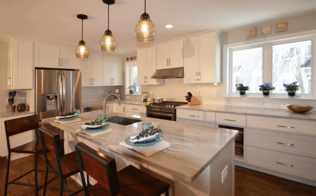
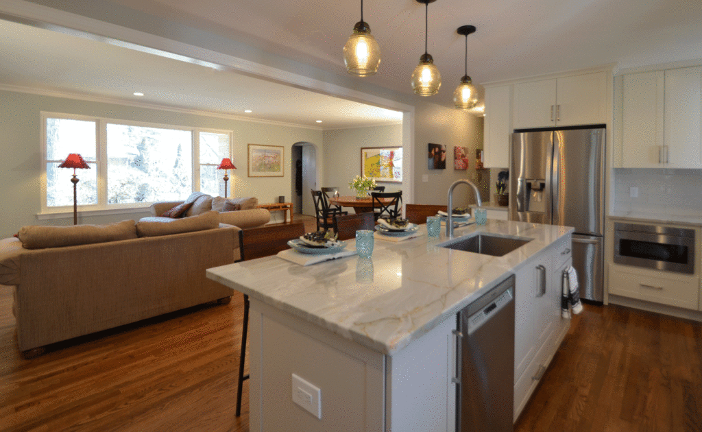
The kitchen is now the showpiece of the home, and you see it the moment you step through the front door. The new kitchen has a large eat-at island that easily accommodates four, with a large kitchen sink facing out into the family room. The aisle is 3’6′, twice the space around the credenza in the original kitchen. Now, Anne can have all the appliance doors open at the same time. The roominess makes the kitchen much more functional for multiple cooks.
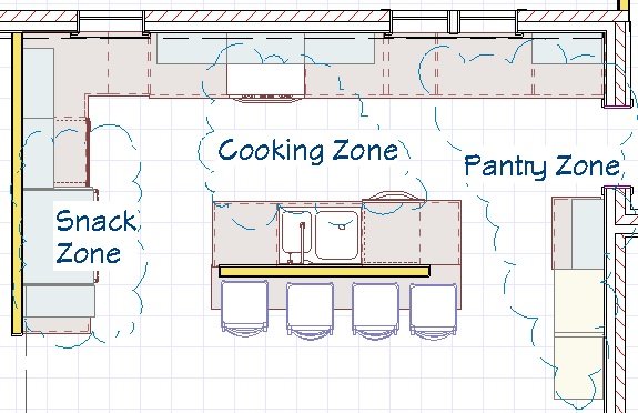
With multiple cooks in mind, we designed the kitchen into 3 zones. Right by the fridge is a snack zone, that features a charging station close to the rear entry and a microwave drawer that is easy for the kids to use. The island sink is just off-center from the range to make it easy to pivot from one spot to another when working in the central cooking zone. The pantry zone, off the garage, features a wall of built-in pantry cabinets and dry goods basket drawer.
Transformation
The new kitchen has three times the amount of counter space as the original, so the stone selection was key to the design. Our designer worked with the client extensively to find the perfect slabs for this kitchen. The final selection was Sea Pearl Quartzite, a natural stone with veining similar to marble, but with all the strength and stain resistance of engineered quartz.
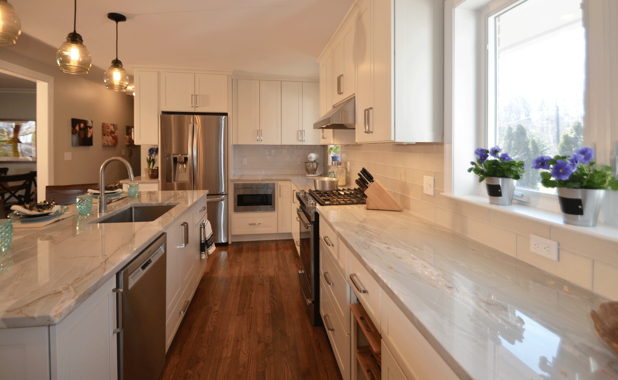
This kitchen was designed for use. The cabinets are solid plywood with full extension drawers & roll outs and soft-close doors. The original kitchen had the microwave over the range, which can be dangerous even for adults to use. We knew we could do better in the new kitchen. So the appliance selections and layout were planned to be kid-friendly. They are smudge-proof, and the bottom freezer and the microwave drawer make access easy and safe.
An Eye for Detail
White kitchens are and will continue to be popular. We paid particular attention to the aesthetic details to ensure that this white kitchen would stand out from the crowd. 39″ wall cabinets were run to the ceiling and topped with a curved crown molding. Cabinet sides were finished with furniture end panels except for the two cabinets by the fridge. Those are turned 90 degrees to create a drop off station by the rear entry. So instead, the upper cabinet was outfitted with an operable side door and the lower with an applied panel.
We wanted the island to have more of a furniture feel, so the toe kick was done away with and replaced with baseboard the wraps all the way around. To keep the kitchen from being a wash of white and stainless steel, we added a dry goods basket cabinet in the pantry zone. The same zone also includes a glass front display cabinet that extends down to the countertop breaking up the white even further. Light gray glass tile brings in a complementary hue with the added benefit of adding a little sparkle.
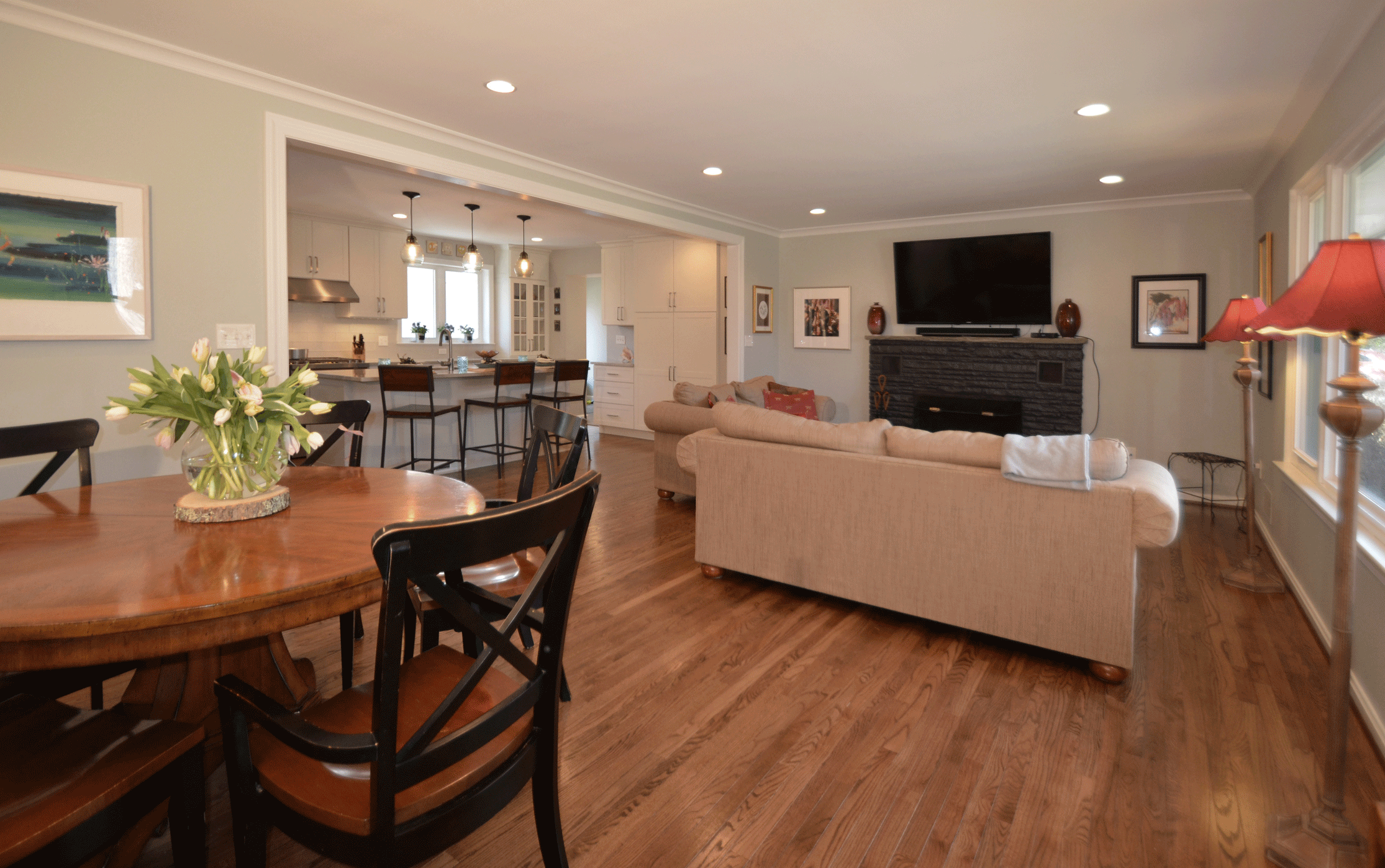
The layout out of this remodeled home flows smoothly from the front door to back and out to the garage. The awkward layout created by the closed-off rooms is gone. Now one straight hallway pulls the home together. We not only improved the flow of the entire house, but we created a showpiece kitchen that lives up to Anne’s dream.
To Schedule a tour of a home like Anne’s, or a free consultation, please contact us here.